Designs
The Designs manager allows you to create, manage and select designs that control the presentation of your content.
Who has access:
You must have one of the checked permissions to use this manager.
Guest
Member
Contributor
Editor
Administrator
Designs Coordinator
Use the Default Design dialog box to select the default design that will be applied to all of the pages within your web site.
- Click the Default Design tab.
- Search the available designs by clicking the Search button. You may optionally narrow your search results by selecting a design style and color group from the available drop-down lists. Select "My Custom Designs" to see the designs you have created using the Designs manager.
- To preview a design full-size using your web site content, click the design's thumbnail in the search results.
- To update your web site's default design, select the design's name below the corresponding preview thumbnail.
- Your current selection will appear below the Save
 icon in the upper right corner of your screen.
- Click the Save
 icon in the upper right corner of your screen to save your design selection.
Use the Additional Designs dialog box to approve designs for selection by your content creators.
- Click the Additional Designs Button.
- Search the available designs by clicking the Search button. You may optionally narrow your search results by selecting a design style and color group from the available drop-down lists.
- To preview a design full-size using your web site content, click the design's thumbnail in the search results.
- To make a design available for selection by your content creators in the Page Editor, select the design name below the design's preview thumbnail. The design thumbnail will appear in the Approved Designs list box.
- To remove designs from the list of designs available to your content creators, select the design name below the design's preview thumbnail in the Approved Designs list box.
- Once you have added all of the additional designs you wish to make available to your content creators, click the Close
 icon in the upper right corner of the screen to exit the dialog box.
To apply additional designs to your site, see the
Pages manager.
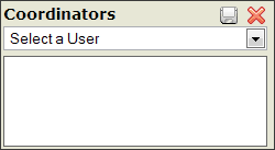 This feature is only applicable to those who have the People manager.
- Select an appropriate person from the drop down menu. The list of names that appear is populated from your People manager. The person must have an email address entered in your People manager in order to appear.
- Click the Save
 icon within the dialog box.
- Repeat steps 2 and 3 for each Coordinator you want to add.
- To delete a Coordinator, click the Delete
 icon to the left of the person's name.
Because of the complexity of CSS our customer service representatives will be happy to assist you with questions related to the Designs manager itself but cannot answer questions related to specific CSS settings. Please see the great tutorials and references available at w3schools.com, htmlhelp.com and wikipedia.com for more information on setting specific CSS attribute values.
-
Click the Add New Design
 icon.
icon.
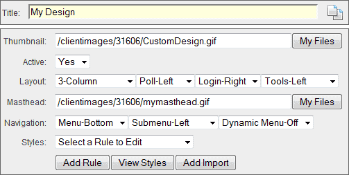
- TITLE: Enter a name for the design. The title will be used to identify the design for selection in site managers and dialog boxes.
- THUMBNAIL: Add a custom preview image for your design by selecting the My Files button, choosing an the image from the files dialog box and pressing the Insert Selected button.
- ACTIVE: Select "Yes" to make your design active and available for use with your web site content. Select "No" to make your design inactive and unavailable for use.
- LAYOUT: Use the layout controls to manage the basic layout of your design.
- Column Control: Determine the number of columns available for the main content area of your web site.
- Poll Control: Determine whether polls are displayed in the left column, right column or not at all.
- Login Control: Determine whether the login form is displayed in the left column, right column or not at all.
- Tools Control: Determine whether the system tools (make this my home page, bookmark this page, search, print, email this page) are displayed in the left column, right column, or not at all.
- MASTHEAD: Customize your design by inserting your own image or flash file. To insert your own masthead, select the My Files button, select the image or flash file from the file dialog box and press the Insert Selected button. You will see a preview of your masthead in the preview window below the design form.
- NAVIGATION: Use the navigation controls to manage how your visitors navigate your site's content.
- Menu Control: Determine where your site's main navigation controls are displayed. Choose top to display the main menu above your masthead. Choose bottom to display the main menu below your masthead. Choose left to display the main menu in the left column of your web site. Choose right to display the main menu in the right column of your web site.
- Submenu Control: Determine where your site's sub-navigation controls are displayed. Choose top to display the submenu above your masthead. Choose bottom to display the submenu below your masthead. Choose left to display the submenu in the left column of your web site. Choose right to display the submenu in the right column of your web site.
- Dynamic Menu: Select "On" to add dynamic popup menus to your site.
- STYLES: Use the style controls to manage the details of your design's look and feel.
- Rule Selector Control: Use the rule selector to choose a design framework container to edit.
- Attribute Selector Control: Use the attribute selector to choose an attribute to edit.
- Value Modifier Control: Enter or choose a new value to change the setting for the currently selected attribute of the currently selected framework container.
- Modifier Control: Some Attributes include an additional Modifier Control. The Modifier Controls include the My Files button used to open the file dialog box when file selection is necessary, the Colors button used to launch the Color Selector dialog box and the Units select box used to select the units of measurement for an attribute.
- Repeat the container, attribute and selection setting process until you have finished creating your design.
- Click the Save
 icon in the upper right corner of your screen to save your settings.
- ADD RULE: Allows you to access less frequently used containers, create more specific selections and add your own classes.
- Precede the selector with # for any object with an id attribute (i.e. #header, #columns, #center-column-content).
- Precede the selector with a period (.) for any object with a class attribute (i.e. .bgLight, .bgMedium, .bgDark, .calendar).
- Combine selectors to access specific objects (i.e. #footer a, #footer a:hover).
- You must enter a valid Cascading Style Sheet selector for an object within the framework for the rule to have any effect.
- VIEW/HIDE STYLES: Used for troubleshooting cascading style conflicts in the context of your entire style sheet and for making minor updates. It also allows you access to copy your styles for use in other programs. Warning: Editing your style sheet manually is not recommended and may cause problems with your design. Note: Do not use CSS shorthand for setting any attributes.
- ADD IMPORT: Allows you to import your own Cascading Style Sheet file from within your My Files area. You can import multiple style sheets if need be.
- The Import System Design icon
 allows you to select an existing design and import the design settings instead of starting from scratch.
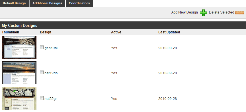
- Select the design's name from the My Custom Designs list.
- Select the framework container you wish to update.
- Select the attribute you wish to edit.
- Edit the value.
- Click the Save
 icon in the upper right corner of your screen.
- Select the delete check box next to the Design's title.
- Click the Delete Selected
 icon. Once a Design is deleted, there is not a way to retrieve the Design.
- Alternatively, you may click the Delete
 icon within the Design itself.

 This feature is only applicable to those who have the